“The MTA’s Capital Program Dashboard gives every New Yorker the ability to monitor critical investments funded in part by congestion pricing. We’re pleased the MTA sought community feedback during its development and are glad to see increased usability as a result. The BetaNYC team and open data community look forward to celebrating this milestone during the 2026 edition of Open Data Week.” – Andrew Kittredge, BetaNYC’s Civic Innovation Lab Director
From MTA’s Press Release:
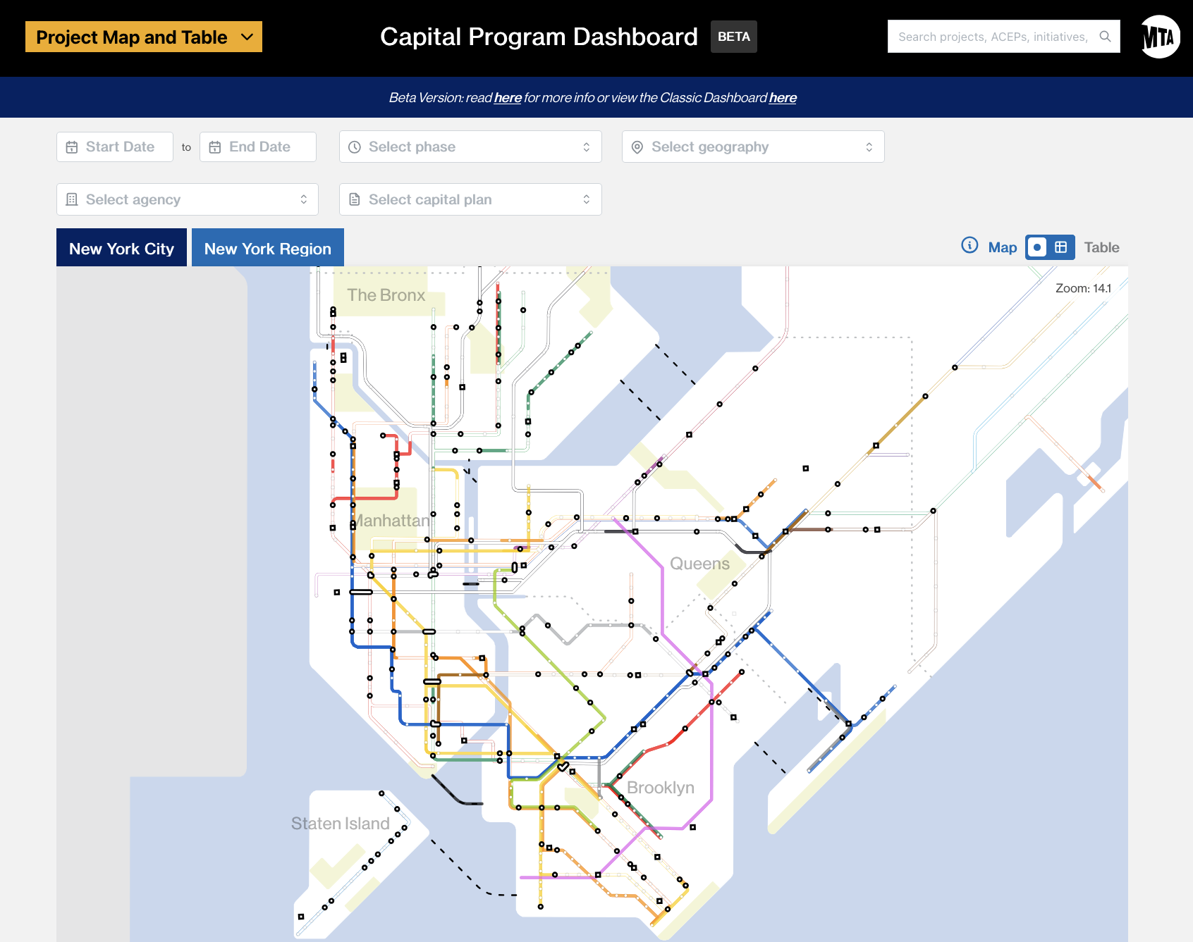
Metropolitan Transportation Authority (MTA) Construction & Development (C&D) today launched a beta version of the redesigned Capital Program Dashboard, offering the public an easier and clearer way to track construction projects across the entire transit system: New York City Transit, Long Island Rail Road, Metro-North Railroad, and Bridges and Tunnels. The dashboard allows users to monitor progress and see what is being built or replaced, where it is happening, what the budget is, how much has been spent, and when it will be completed.
First introduced in 2010, the Dashboard has been redeveloped with modern web technology to better reflect how the MTA is rebuilding and modernizing the transit system – and how the Authority is using smart, innovative construction methods. With improved navigation, search fields, and filtering tools, the new dashboard empowers the public to better understand and engage with information surrounding the hundreds of transit construction projects throughout the New York region, including whether they are funded by the Congestion Relief Zone tolling program.
The dashboard currently includes all accessibility projects active in construction, projects in the procurement pipeline, and candidate locations for projects in the 2025-2029 Capital Plan. Additional projects and information will be added as C&D continues to refine features and functionality.
Key upgrades to the dashboard include:
- A new “Transit Service” view. This simplifies finding a project by grouping infrastructure projects by the transit routes they affect and a redesigned map that clearly shows where work is happening across the system. Users can click on a specific line to see the multiple projects that have been completed, underway, and planned across the entire route – ranging from accessibility upgrades, Communications-Based Train Control (CBTC) installation, state-of-good-repair work and other station upgrades.
- A new “Initiatives” view. This allows users to see projects categorized by major priorities such as ‘Accessibility’ or ‘Resilience’. This also includes an initiative around Congestion Relief to allow users to see which projects have been enabled by the Central Business District Tolling Program.
- Real-world projects focused. The updated dashboard shifts the focus from using internal budget codes as the primary reporting structure to a way that makes more sense to the public – by project bundles that better reflect how we actually coordinate construction tasks, and contract and execute projects.
For detailed information about the Capital Program Dashboard including how it was developed, how to navigate all its features and more about the history of capital data reporting, see this three-part blog series, Behind the Capital Program. The MTA is also inviting users to provide feedback while the dashboard continues to be refined and uploaded with more projects.